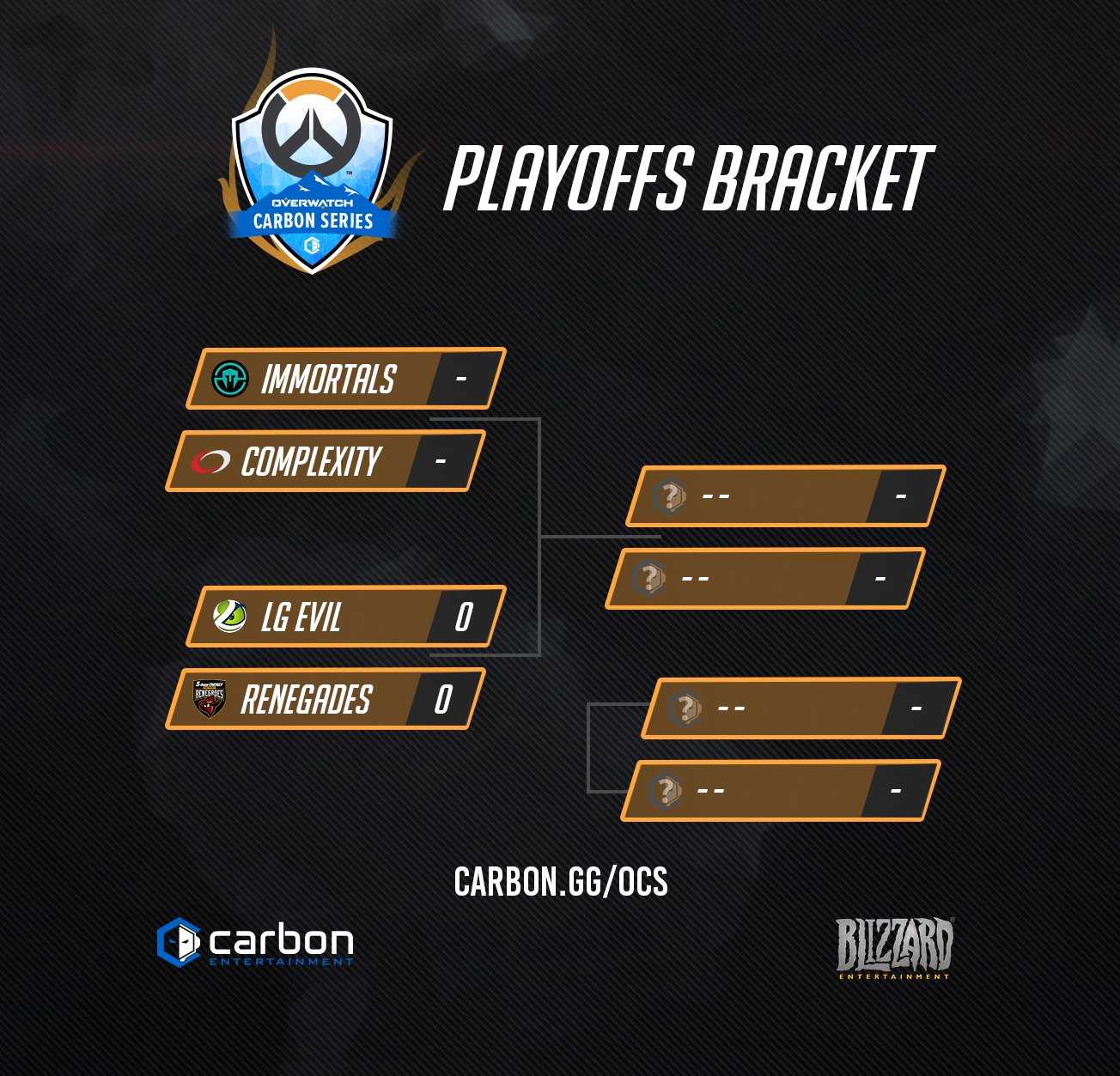
The Overwatch Carbon Series featured six of the fiercest North American competitive Overwatch teams in a series of online matches, broadcast on Carbon Entertainment’s Twitch channel. Teams participated in 10 competitive matches spanning five weeks of prime time competitive play, culminating in a Top 4 Overwatch Carbon Series Playoffs. This was one of pivotal moments of Overwatch eSports, a hint at the beginning to come.
The Overwatch Carbon Series logo represents the combined balance between the Carbon brand and the Overwatch brand to inspire a competitive edge. Keeping the Overwatch logo as the main focus, the other elements serve to focus and enhance the logo as a whole. The flame, which takes from all Carbon Series and is based off the Olympic flame and what it stands for. The blue mountains are inspired directly off of Carbon’s location in beautiful Colorado. Everything comes together with the geometric backdrop of the shield which incorporates Overwatch’s branding and it creates the illusion of a mountainous backdrop. The usage of the iconic overwatch orange and the energetic carbon blue creates an incredible complimentary balance that excites and add to the piece.
Carbon Events have always been very bright and blue and the Overwatch Carbon Series reflects that personality, while also taking a step back and letting the Overwatch brand shine. Overwatch’s Branding is bright and hopeful, using soft grey geometric backgrounds with orange used as accents.
The broadcast package which includes, Lower Thirds, Transition, and Full-screen assests were designed specifically for Overwatch Carbon Series. Similar to the logo, the broadcast package is a mix between Overwatch’s bright and hopeful brand and the esports centric brand of Carbon. All the elements come together to enhance the broadcast and give the audience a truly premiere impression.
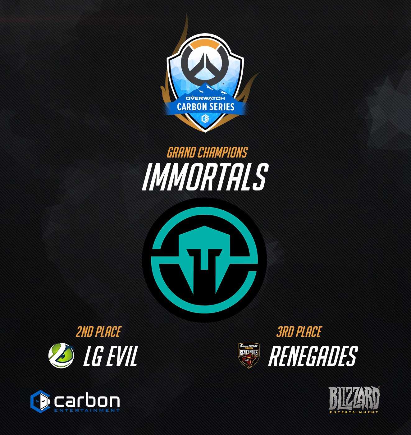
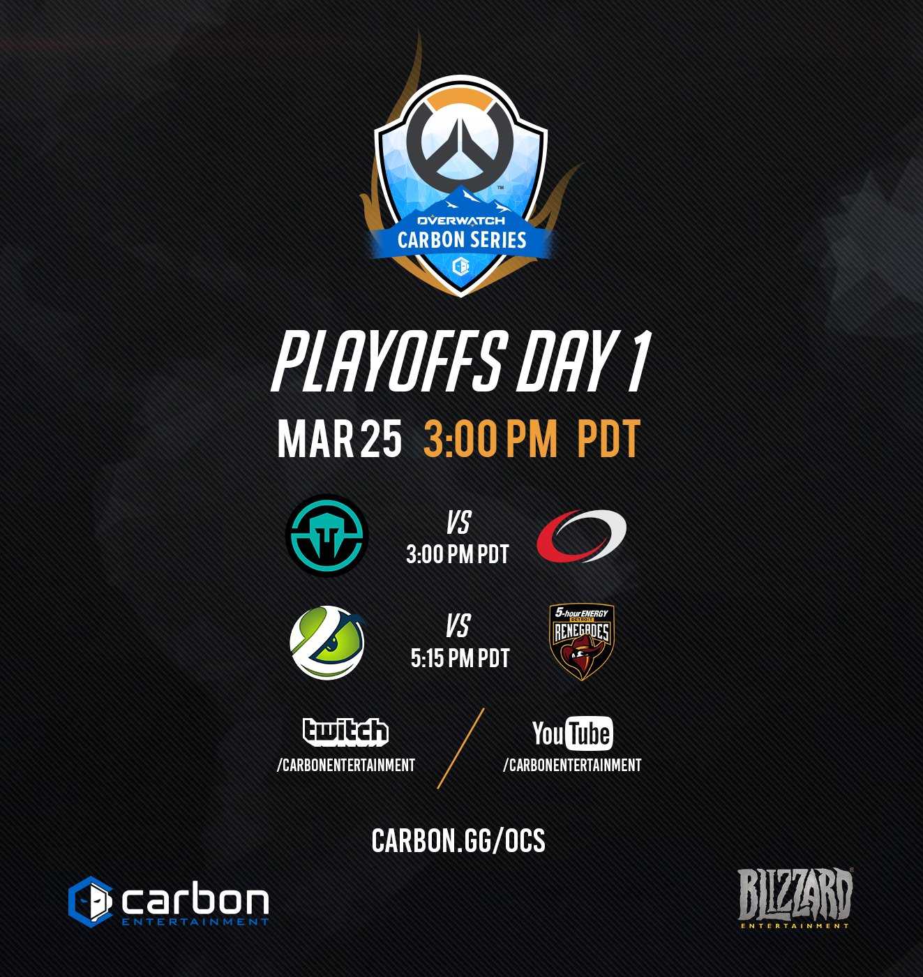
This Social Media posts package is created based off of the logo, objectives of the tournament, and Overwatch branding. Each graphic is created to be unified and consistent in format, feel, and approach. This includes the consistent Carbon Logo, Blizzard, Logo and the Overwatch Carbon Series logo on top, black carbon fiber map background, fonts, and accents when they are used. I wanted the audience to feel like this was a premium series to be tunning into rather than the usual small tourney streams. I particularly loved playing into an already existing element of Overwatch’s graphics, with the grey diagonal lines as it gave the brighter graphics a interesting texture to be the foreground of.


