Frozen Spirals is a rolled ice cream shop located in Westminster, Colorado. I worked on taken the existing logo and brand and created product designs (tshirts, cups, spoons) and promotional assets. I wanted the assets to feel handcrafted and homely as this was a small family own business and I wanted to convey the same charm of the owners and their ice cream to the design assets.
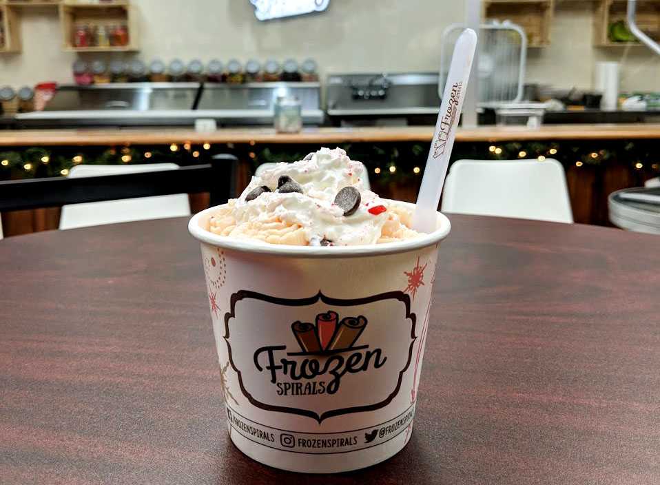
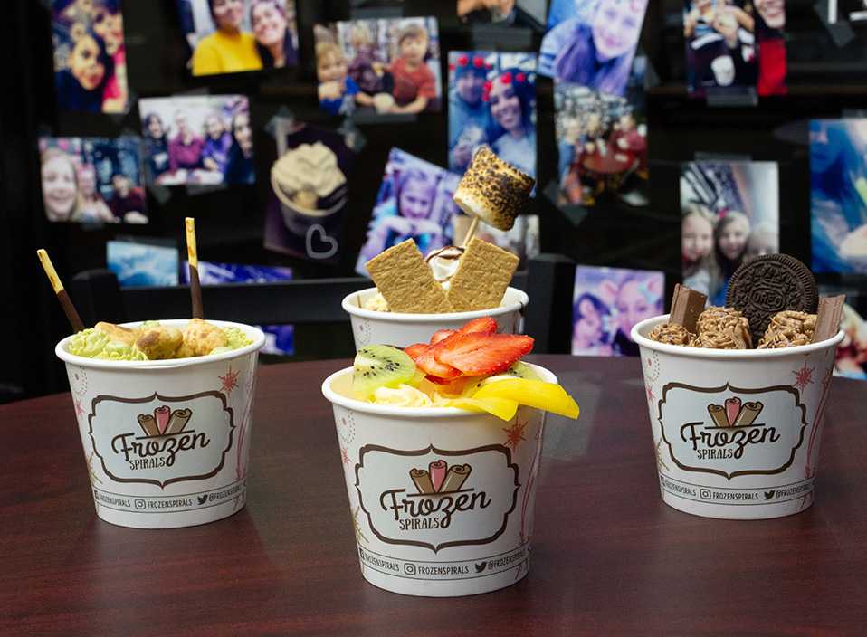
I wanted the design here to feel handcrafted and Instagrammable. I wanted it to feel like these were almost stickers that were attached to the cup in a way to play into the homely atmosphere of the store. I also wanted there to be movement all the way around the cup, so I added swirls along with snowflakes to really play into the store’s name “Frozen Spirals”.
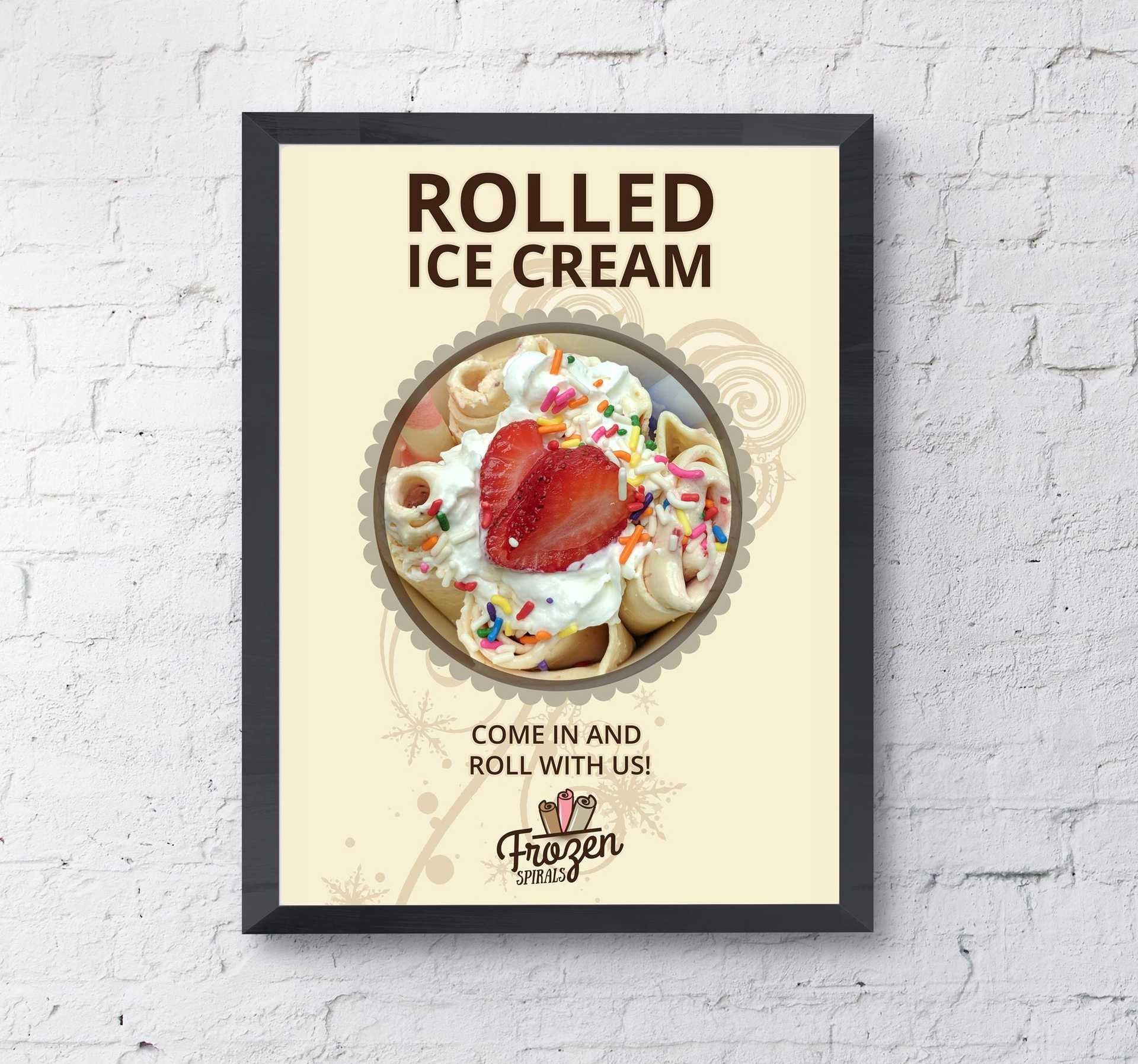
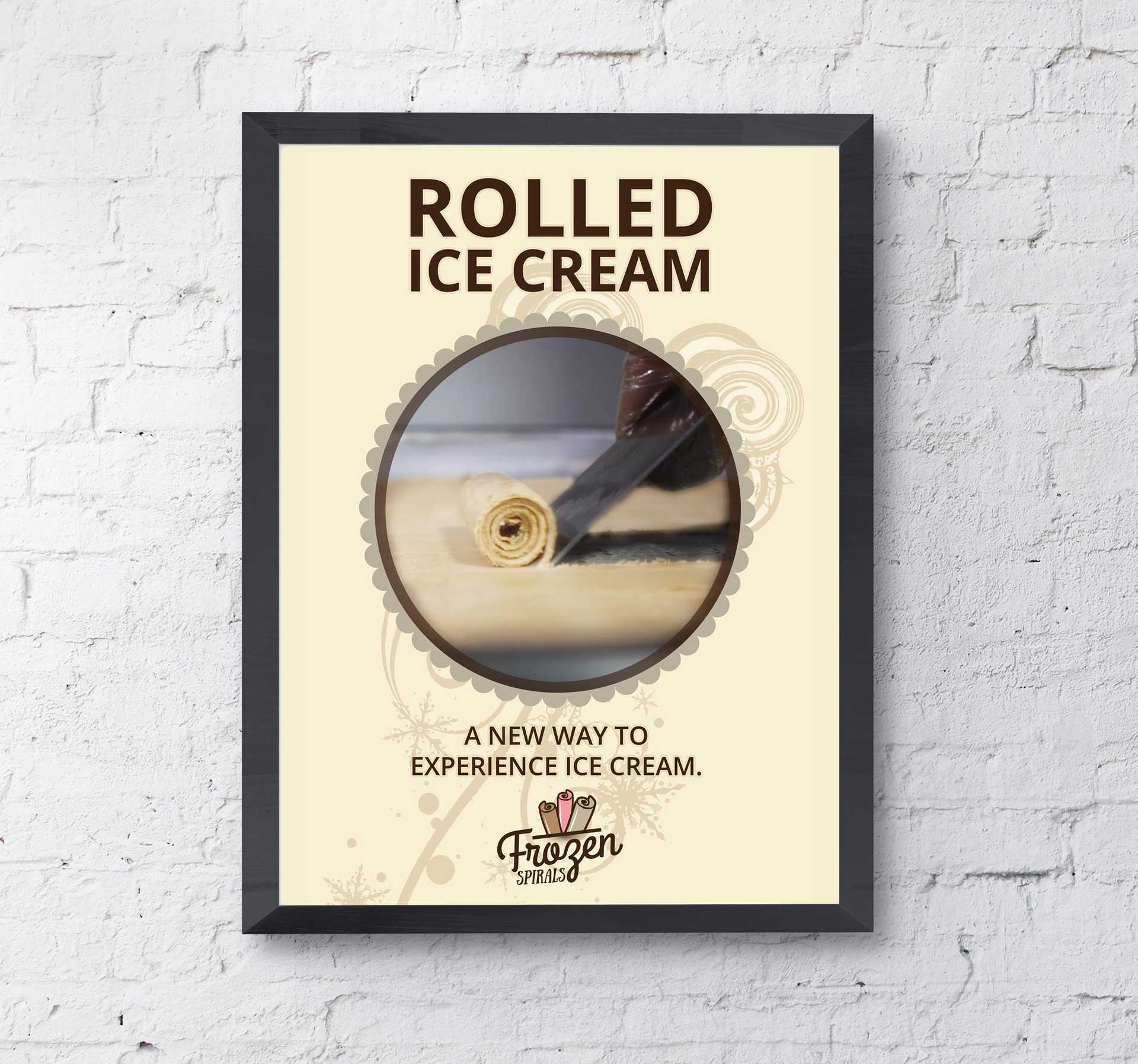
These were promotional posters used on the side of the store. Taking the same “swirl” graphic designed for the cup I incorporated it into the poster in a diagonal line, so your eye is naturally drawn from the bottom up, with the focus on the ice cream. The coloring is purposefully toned down, so your eyes look at the yummy treat rather than all focus on the graphic. I wanted the market audience to stop, look at the poster and feel like they must come in and try the ice cream.
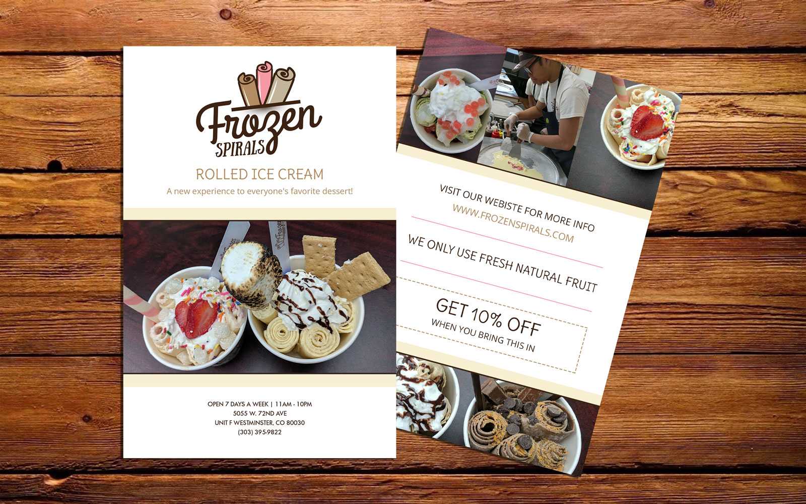
These were mailers/flyers given out to attract new business at the start of opening. I think the hierarchy here is the most important as the focus here is on the discount, the ice cream, and location.
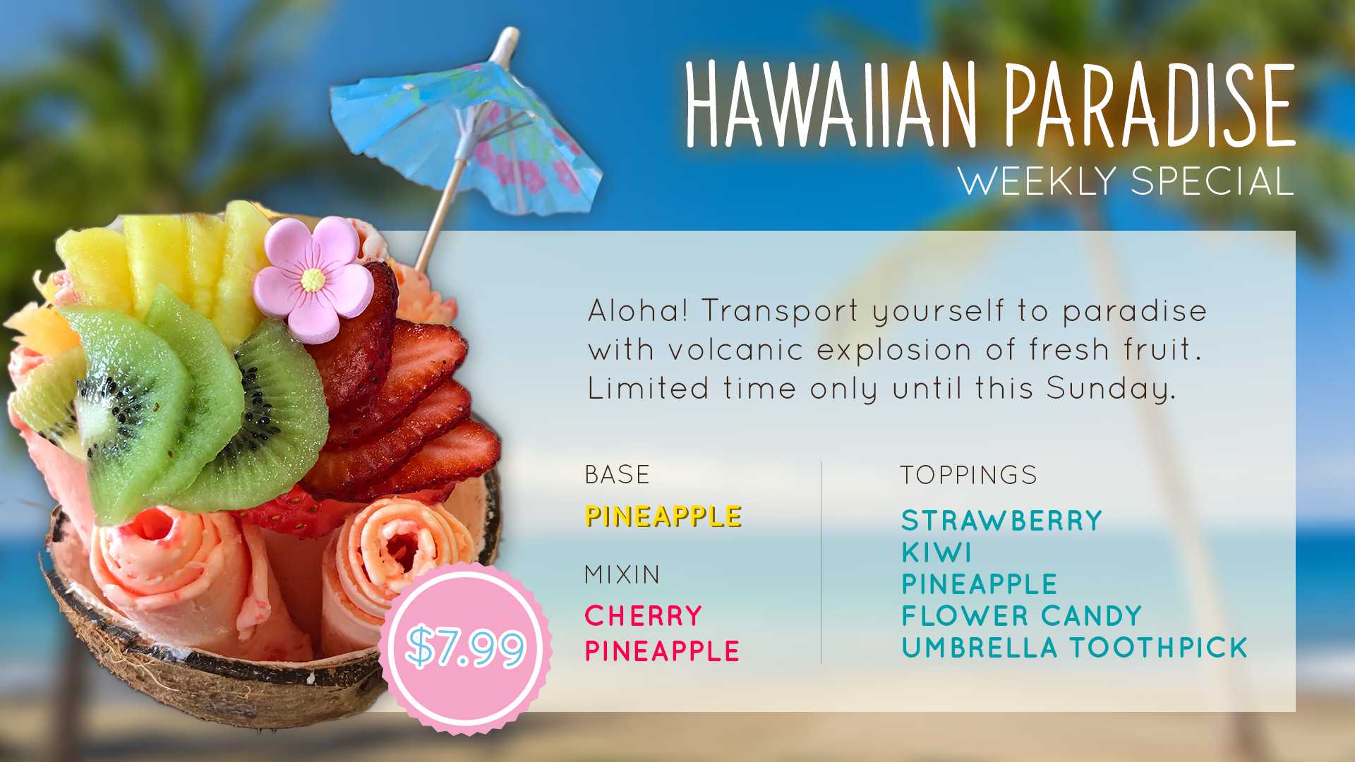
This was weekly/monthly specials that were designed to display on the promotional TV in the store, as well as Instagram and the stores FB page. I would both take the photos and design the content for these assets. I really wanted each poster to feel unique so aside from using the brand font for description these really had more creative freedom each week. I had a lot of fun making each special look absolutely irresistible and playing into each theme.


